Posts

Amending graphic novel page.

Image
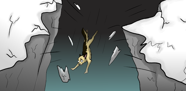
 (Before) (After) When changing my graphic novel page, I took advice from Bill and changed the angle of the breaking cliffs and also focused on making the front of the cliff appear closer to the reader by thickening the lines and decreasing the opacity of the lines towards the back of the cliff. I personally think that I have improved this panel and the angle works better than the first attempt.
Feedback on falling scene.

Image
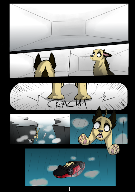
This scene is supposed to show that the floor has come apart and the two cliffs are coming apart from each other. My teacher - Bill gave me the advice that the cliffs look too high up and should be at a flatter angle and more on a lean to show that they're falling away from each other. The movement lines should also come off of the character rather than coming from all different directions, I will be responding to this feedback by following Bills advice by making the angle better.

Ribble FM final turnaround.

Image

Pug research.

Image

Black paper art - research.

Image

Character design research.

Image